Designing Effective Data Visualizations
A Practical Guide to Dashboard Design and Presentation with Streamlit
"Our dashboards aren't being used." "We have data, but it's not leading to better decisions."
These are common frustrations in data-driven organizations. The problem is often not the data itself, but its presentation. The value of analysis is only realized when insights are communicated clearly and effectively.
This chapter moves beyond basic charts to explore practical techniques for creating compelling, user-friendly data visualizations and dashboards with Streamlit.
The Core Principles of Effective Visualization
Before writing code, it is crucial to understand the principles of effective data visualization.
- Have a Clear Purpose: Every chart and dashboard should answer a specific business question. Start by defining the key message you want to convey.
- Choose the Right Chart: Different charts tell different stories. Select a visualization that accurately represents your data and supports your message.
- Embrace Simplicity: Remove anything that does not add value. Eliminate visual clutter like unnecessary gridlines, borders, and distracting colors to let the data speak for itself.
- Ensure Consistency: Use a consistent style for colors, fonts, and layouts across your dashboard to create a professional and cohesive user experience.
- Enable Interaction: The best dashboards empower users to explore the data themselves. Provide filters, drill-downs, and other interactive elements to encourage discovery.
Streamlit is well-suited for this, as it allows you to blend interactive charts with clear, Markdown-formatted text. Placing explanations alongside visualizations helps build dashboards that are not just seen, but understood.
Choosing the Right Visualization Library
Streamlit supports a wide range of Python visualization libraries. The choice should depend on your specific goals.
| Library | Recommended Use Case | Key Strength |
|---|---|---|
Streamlit Native (st.line_chart) | Rapid Prototyping | Simplicity; create a chart with a single line of code. |
| Plotly | Interactive Business Dashboards | Rich interactivity and a vast library of modern chart types. |
| Altair | Statistical & Academic Visualization | Declarative syntax based on the Grammar of Graphics. |
| Matplotlib | Publication-Quality Static Charts | Fine-grained control over every plot element. |
| Bokeh | Large-Scale & Streaming Data | High-performance visualization for demanding applications. |
Recommendation:
- Start with Streamlit's native charts for initial exploration.
- Use Plotly for polished, interactive business dashboards.
AI assistants significantly reduce the learning curve for any of these libraries, making it easy to generate code for a complex Plotly chart.
1. Streamlit Native Charts
Perfect for quick checks and simple visualizations.
import streamlit as st
import pandas as pd

sales_data = pd.DataFrame({
    'month': ['Jan', 'Feb', 'Mar', 'Apr', 'May', 'Jun'],
    'sales': [100, 120, 140, 110, 160, 180]
})
st.line_chart(sales_data.set_index('month'))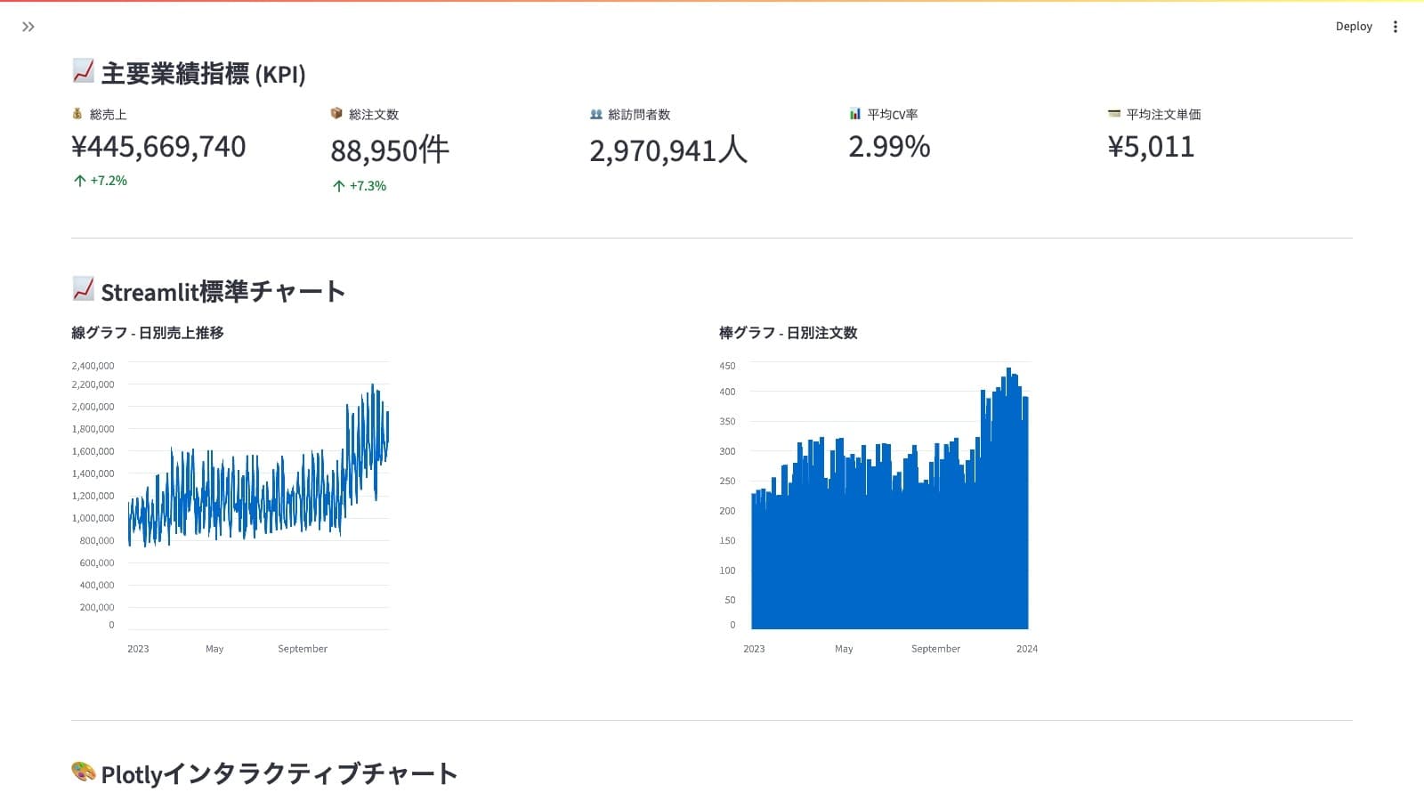
2. Plotly
The standard for interactive, production-quality dashboards.
import plotly.express as px

fig = px.bar(sales_data, x='month', y='sales', title='Monthly Sales Performance')
st.plotly_chart(fig, use_container_width=True)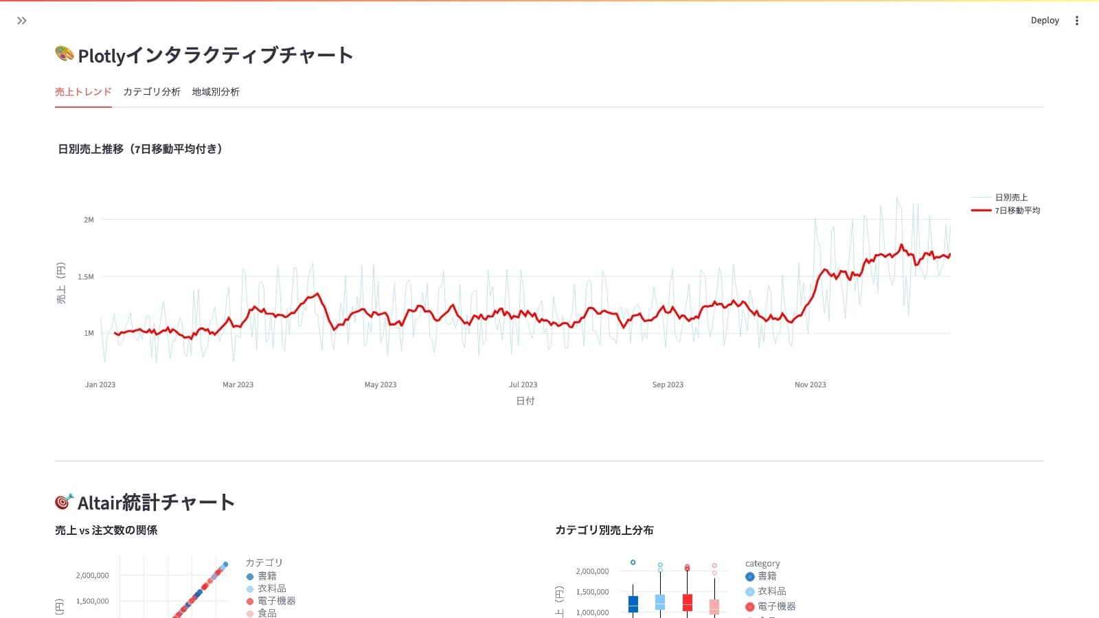
3. Altair
A powerful choice for statistical visualization with a declarative syntax.
import altair as alt

chart = alt.Chart(sales_data).mark_bar().encode(
    x='month',
    y='sales'
).properties(title='Monthly Sales Performance')
st.altair_chart(chart, use_container_width=True)
Dashboard Layout and Design Patterns
A clean, intuitive layout is as important as the charts themselves. Streamlit provides simple yet powerful tools for building professional-looking dashboards.
Pattern 1: The KPI Row
Use st.columns to display Key Performance Indicators (KPIs) at the top of your dashboard for a high-level overview.
col1, col2, col3 = st.columns(3)
col1.metric("Sales", "¥12.34M", "12%")
col2.metric("Profit", "¥1.2M", "-8%")
col3.metric("Customers", "1,234", "3%")
Pattern 2: The Sidebar for Filters
Place filters and controls in the sidebar to keep the main dashboard area clean. This is a standard convention that users will immediately understand.
with st.sidebar:
    st.header("Filters")
    department = st.selectbox("Department", ["Sales", "Marketing", "Engineering"])
    date_range = st.date_input("Date Range", [])
Pattern 3: Grouping with Containers and Tabs
Use st.container to group related charts and st.tabs to organize different sections of your analysis.
with st.container(border=True):
    st.subheader("Sales Performance Analysis")
    # ... add charts and metrics ...

tab1, tab2 = st.tabs(["Trend Analysis", "Regional Breakdown"])
with tab1:
    st.line_chart(...)
with tab2:
    st.bar_chart(...)
Pattern 4: Hiding Details with Expanders
Place detailed data tables or lengthy explanations inside an st.expander to keep the main view uncluttered while providing access to underlying data.
with st.expander("View Raw Data"):
    st.dataframe(sales_data)
Adding Interactivity
The best dashboards invite users to explore. Here’s how to add common interactive features.
Implementing Filters
Place filters in the sidebar for easy access.
with st.sidebar:
    category = st.selectbox("Select a Product Category", df['category'].unique())
    sales_range = st.slider("Filter by Sales Range", 0, 1000, (100, 500))

filtered_data = df[
    (df['category'] == category) &
    (df['sales'].between(sales_range[0], sales_range[1]))
]
st.dataframe(filtered_data)
Enabling Drill-Downs
Allow users to navigate from a high-level overview to detailed data.
country_chart = alt.Chart(df).mark_bar().encode(x='country', y='sum(sales)')
selected_country = st.selectbox("Select a Country for Drill-Down", df['country'].unique())

city_df = df[df['country'] == selected_country]
city_chart = alt.Chart(city_df).mark_bar().encode(x='city', y='sum(sales)')

st.altair_chart(country_chart)
st.altair_chart(city_chart)
AI-Powered Chart Generation
Generative AI tools can dramatically accelerate development. Complex charts can now be generated in minutes from a natural language prompt.
Generating Plotly Code with AI
Let's ask an AI assistant to create a Plotly chart.
Effective Prompt:
You are an expert data analyst. Generate Python code using Plotly to create a bar chart showing sales by region.

**Requirements:**
- The data is in a pandas DataFrame named `data` with columns `region` and `sales`.
- Display the sales value on top of each bar.
- Use a different color for each region.
- The code should be a complete, runnable script for a Streamlit app.
Example AI-Generated Code:
import plotly.express as px
import streamlit as st
import pandas as pd

data = pd.DataFrame({
    'region': ['North', 'South', 'East', 'West'],
    'sales': [2500, 2800, 3200, 2900]
})

fig = px.bar(data,
             x='region',
             y='sales',
             title='Regional Sales Performance',
             labels={'sales': 'Sales (USD)', 'region': 'Region'},
             color='region',
             text='sales')

fig.update_traces(texttemplate='$%{text:.2s}', textposition='outside')
fig.update_layout(uniformtext_minsize=8, uniformtext_mode='hide')

st.plotly_chart(fig, use_container_width=True)
Prompt Engineering for Visualizations
- Be Specific: Instead of "make a graph," say "create a scatter plot of sales vs. profit, and color the points by product category."
- Provide Data Structure: Give the AI a sample of your DataFrame's columns and data types.
- Specify the Library: "Generate the code using Plotly Express."
- Define the Output: "The output should be a single Python script ready to run in Streamlit."
Summary and Next Steps
You now have a solid foundation for designing effective data visualizations and dashboards. The key is to combine design principles with the power of modern tools.
Action Plan
- Start Simple: Create a basic chart with
st.line_chartusing your own data. - Leverage AI: Ask an AI assistant to generate a more complex Plotly chart.
- Design a Layout: Build a simple KPI dashboard using
st.columnsandst.metric. - Add Interactivity: Implement a sidebar filter that updates a chart.
Keys to Success
| Principle | Action |
|---|---|
| Clarity First | Always start with the question you want to answer. |
| User-Centric Design | Build dashboards for your audience, not for yourself. |
| Iterate and Refine | Start with a simple prototype and improve it based on user feedback. |
| Embrace AI Assistance | Let AI handle boilerplate code so you can focus on insights. |
In the next chapter, we will explore on-demand analysis dashboards using Text-to-SQL and Text-to-Python, allowing users to ask questions in natural language and receive instant visualizations.
Reference Links & Resources
Official Documentation
Tutorials & Guides
Data Visualization Best Practices
- The Visual Display of Quantitative Information by Edward Tufte
- Fundamentals of Data Visualization by Claus O. Wilke
- Storytelling with Data by Cole Nussbaumer Knaflic
Get your first dashboard in 10 minutes
Free to get started · No credit card required
Start talking to your data