From Analysis to Application
A Practical Guide to EDA with Jupyter and Streamlit
While the previous chapters focused on building dashboards, a dashboard without meaningful insights is merely a collection of charts. This chapter covers the data analysis that powers effective BI.
A basic familiarity with Python syntax and pandas operations is recommended.
Why Exploratory Data Analysis is Critical for BI
A dashboard that looks impressive but offers no real value often results from visualizing data without first understanding it.
Exploratory Data Analysis (EDA) is the process of investigating data to understand its structure, uncover patterns, and detect anomalies before building visualizations. It is the key to moving from simply displaying data to understanding it.
Through EDA, you might discover:
- A sudden sales drop is linked to a specific product recall.
- High customer churn is concentrated in a single geographic region.
- "Average" user behavior is actually a composite of two distinct user groups.
These are the insights that drive informed business decisions. While traditional BI tools are effective for monitoring known metrics, they often lack the flexibility required for deep, exploratory work.
The Modern Data Analysis Workflow
The Python ecosystem provides a seamless workflow from initial exploration to a deployed application. This chapter follows a four-stage process:
- Explore (Jupyter Notebook): Start with broad questions to get a feel for the data and form initial hypotheses.
- Validate (Jupyter Notebook): Use statistical methods and further visualization to test hypotheses and solidify findings.
- Visualize (Streamlit): Transform validated insights into an interactive dashboard for business users.
- Operate & Iterate: Deploy the dashboard, monitor its usage, and use feedback to fuel the next analysis cycle.
This structured approach ensures the development of dashboards that are not only well-designed but also genuinely useful.
Choosing the Right Tool for the Job
Effective data analysis requires using the right tool for each task.
| Tool | Best For | Key Strength | Limitation |
|---|---|---|---|
| Excel | Quick, simple analysis and reporting. | Ubiquity and ease of use. | Poor for large datasets and complex analysis. |
| Jupyter | Deep, exploratory analysis and research. | Unmatched flexibility for statistics and ML. | Not ideal for sharing with non-technical users. |
| Streamlit | Building and sharing interactive dashboards. | Turns analysis into a user-friendly application. | Not designed for initial, freeform exploration. |
The Analyst's Toolkit: Jupyter + Streamlit
For this workflow, Jupyter Notebook is ideal for the Explore and Validate stages. Its interactive, cell-by-cell execution enables a "dialogue with your data," allowing for rapid hypothesis testing and visualization.
Once key insights are uncovered, Streamlit is the perfect tool for the Visualize and Operate stages. It transforms static analysis into a dynamic, shareable application.
This combination, powered by the same Python backend, creates a powerful and seamless development experience.
A Note for Excel Users
Many common Excel operations have more powerful equivalents in Python's pandas library.
| Excel Operation | Python (pandas) Equivalent | Advantage |
|---|---|---|
| Pivot Table | df.groupby().agg() | More flexible aggregation capabilities. |
| VLOOKUP | pd.merge() | Easily join datasets on multiple keys. |
| Filtering | df[df['column'] > value] | Supports complex, multi-level conditional logic. |
| Charting | df.plot() (or Seaborn/Plotly) | Access to a vast library of advanced statistical visualizations. |
Case Study: Analyzing Employee Attrition with Jupyter
This case study demonstrates the end-to-end process of analyzing the IBM Employee Attrition dataset to understand why employees are leaving.
The recommended environment is GitHub Codespaces, which provides a powerful, browser-based Jupyter environment with GitHub Copilot for AI assistance.
Stage 1: Exploration - Getting to Know the Data
First, load the data and perform basic checks to understand its structure.
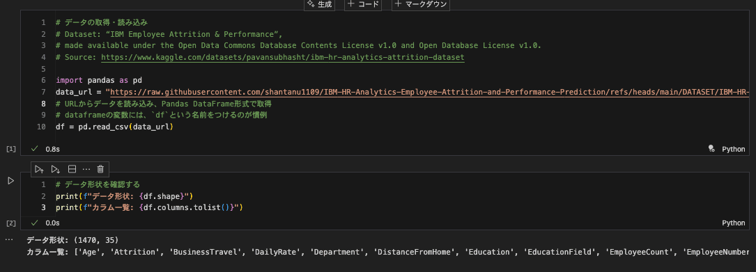
- Initial Finding: The dataset contains 1,470 rows and 35 columns, covering demographics, job roles, satisfaction scores, and attrition status.
Next, use df.head() and df.info() for a closer look.

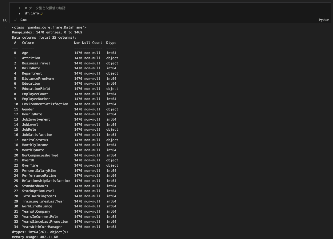
- Observations: The data is clean with no missing values. It includes a mix of categorical (
Department) and numerical (MonthlyIncome) variables. The target variable isAttrition.
Stage 2: Validation - Digging for Insights
Now, form and test hypotheses. Let's investigate the relationship between attrition and factors like age and income.


- Hypothesis 1: Younger employees are more likely to leave. The age distribution chart supports this.
- Hypothesis 2: Lower income correlates with higher attrition. The box plot clearly shows that the income distribution for employees who left is lower than for those who stayed.
To extend this, build a simple machine learning model to predict attrition and identify the most significant factors.

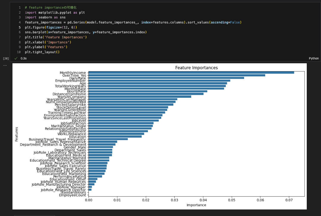
- Key Finding: The model identifies
MonthlyIncome,OverTime, andAgeas top predictors of attrition, providing concrete areas for retention strategies.
Best Practices for EDA in Jupyter
1. Structure Your Notebooks with Markdown Use headings to create a clear narrative.
# Employee Attrition Analysis
## 1. Introduction
## 2. Data Loading & Exploration
## 3. Analysis of Key Factors
## 4. Predictive Modeling
## 5. Conclusion
2. Document Your Thought Process Use Markdown cells to explain why you are performing an analysis and what you conclude from the results. This turns a notebook into a shareable asset.
3. Leverage AI Assistants Use tools like ChatGPT or GitHub Copilot to accelerate your workflow.
- Generate boilerplate code: "Generate Python code to load a CSV and display the first 5 rows."
- Create complex visualizations: "Create a violin plot of monthly income by job role and attrition status."
- Suggest statistical methods: "What statistical test should I use to determine if the difference in mean income between employees who left and stayed is significant?"
From Jupyter to Streamlit: Turning Analysis into an Application
The final step is to share your findings by transitioning from a static Jupyter notebook (a report for analysts) to a dynamic Streamlit application (an interactive tool for business users).
The Migration Workflow
The final code for this can be found at content/06_DATA_ANALYSIS/example-notebook/dashboard.py.
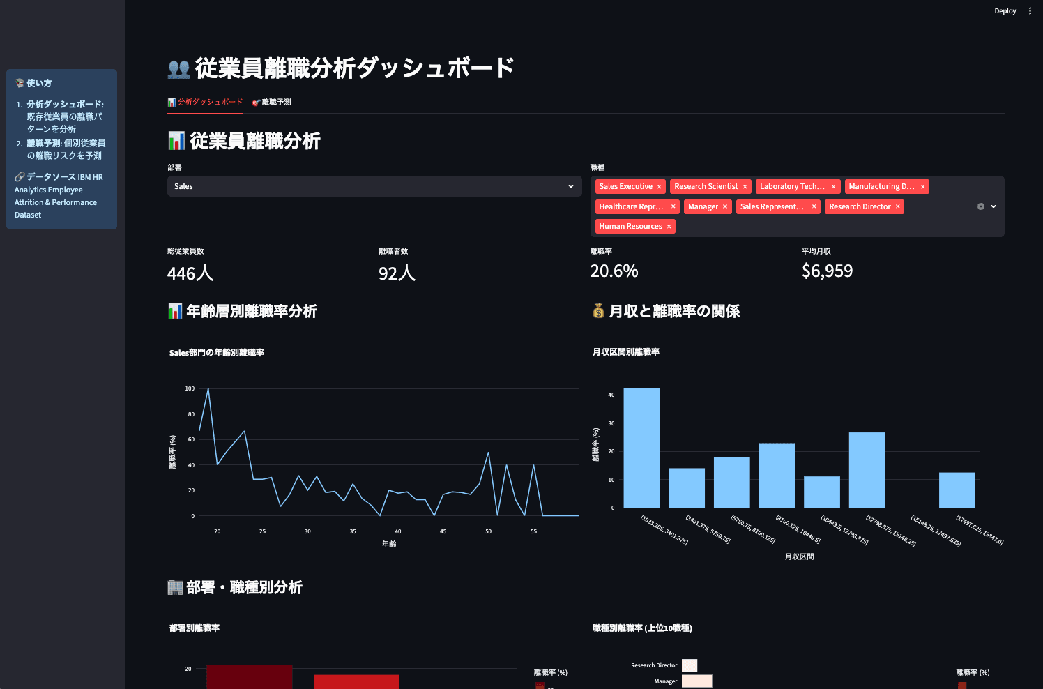
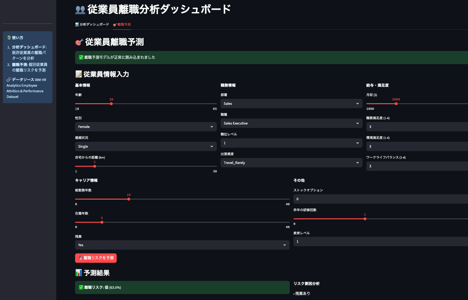
Here’s a practical workflow for this migration:
1. Identify Key Insights for a Broader Audience Review your notebook and select the most valuable findings for the business.
- Which charts are most impactful?
- What are the key takeaways?
- What would a business user want to explore further?
2. Design for Interaction Convert static analysis into an interactive experience to empower users to ask their own questions.
Jupyter (Static):
# Analyze a fixed age group
filtered_df = df[df['Age'] < 30]
# ... plot results ...
Streamlit (Interactive):
# Let users select the age group
age_slider = st.slider('Select Age Range', 18, 60, (25, 35))
filtered_df = df[(df['Age'] >= age_slider[0]) & (df['Age'] <= age_slider[1])]
# ... plot results ...
An AI assistant can help with this conversion. A prompt like the one below can automate much of the work:
"Based on the analysis in
analysis.ipynb, build a Streamlit dashboard that visualizes the attrition rate by department. Add interactive widgets to filter by job role and monthly income."
3. Optimize for Performance Dashboards need to be fast. Use Streamlit's caching functions to avoid re-running expensive computations.
# Use @st.cache_data for heavy data loading/processing
@st.cache_data
def load_data(path):
    df = pd.read_csv(path)
    # ... heavy preprocessing ...
    return df

# Use @st.cache_resource for ML models
@st.cache_resource
def load_model():
    return joblib.load('model.pkl')

# Load data and model
df = load_data('data.csv')
model = load_model()
Summary: A Powerful Workflow for Data-Driven Insights
This chapter covered a complete workflow for turning raw data into an interactive application.
Key Takeaways:
- Start with Why: Begin with EDA to understand your data before building.
- Use the Right Tool: Use Jupyter for exploration and Streamlit for sharing insights as an application.
- Tell a Story: Structure your analysis as a narrative, documenting questions, findings, and conclusions.
- Migrate with Purpose: When moving from Jupyter to Streamlit, focus on turning static findings into interactive tools for business users.
Next Steps
Apply this four-stage workflow to a dataset you are familiar with. Use AI to assist, document your journey in a notebook, and share your insights in a Streamlit app.
The next chapter will focus on presentation: how to design compelling visualizations and structure your dashboard to communicate findings effectively.
Get your first dashboard in 10 minutes
Free to get started · No credit card required
Start talking to your data